PV: pvlib
This notebook demonstrates how to use the PV generation method that is based on pvlib to simulate the PV generation for multiple setups.
Imports
Import required libraries and set visualization defaults.
import os

import matplotlib.pyplot as plt
import pandas as pd

from entise.constants import SEP, Types
from entise.constants import Columns as C
from entise.core.generator import Generator as TSGen

%matplotlib inline
Load Data
We load the PV parameters from objects.csv and simulation data from the data folder.
cwd = '.'  # Current working directory: change if your kernel is not running in the same folder
objects = pd.read_csv(os.path.join(cwd, 'objects.csv'))
data = {}
common_data_folder = "../common_data"
for file in os.listdir(os.path.join(cwd, common_data_folder)):
    if file.endswith(".csv"):
        name = file.split(".")[0]
        data[name] = pd.read_csv(os.path.join(os.path.join(cwd, common_data_folder, file)), parse_dates=True)
data_folder = 'data'
for file in os.listdir(os.path.join(cwd, data_folder)):
    if file.endswith('.csv'):
        name = file.split('.')[0]
        data[name] = pd.read_csv(os.path.join(os.path.join(cwd, data_folder, file)), parse_dates=True)

print('Loaded data keys:', list(data.keys()))
print(objects)
Loaded data keys: ['weather']
Instantiate and Configure Model
Initialize the time series generator and add the objects.
gen = TSGen()
gen.add_objects(objects)
Run the Simulation
Generate sequential PV generation time series for each object.
summary, df = gen.generate(data, workers=1)
100%|██████████| 8/8 [00:04<00:00, 1.98it/s]
Results Summary
Below is a summary of the annual electricity generation, maximum generation and the full load hours of each system.
print("Summary:")
summary_kwh = summary
summary_kwh[f'{Types.PV}{SEP}{C.GENERATION}'] /= 1000
summary_kwh.rename(columns=lambda x: x.replace('[Wh]', '[kWh]'), inplace=True)
summary_kwh = summary_kwh.round(0).astype(int)
print(summary_kwh)
Summary:
          pv:generation[kWh]  pv:maximum_generation[W]  pv:full_load_hours[h]
367791                  7629                      5776                   1075
31991680                2752                      2519                    949
31991682                4459                      3177                   1351
31991685                 949                       786                   1187
31991686                8472                      6344                   1177
31991688               23050                     17373                   1226
31991690                   1                         1                   1108
31991691                5844                      4623                    680
Visualization of Results
Analyze PV generation from various angles.
# Preparation
# Convert index to datetime for all time series
for obj_id in df:
    df[obj_id][Types.PV].index = pd.to_datetime(df[obj_id][Types.PV].index)

# Get azimuth and tilt values from objects dataframe
system_configs = {}
for _, row in objects.iterrows():
    obj_id = row['id']
    if obj_id in df:
        azimuth = row['azimuth[degree]'] if not pd.isna(row['azimuth[degree]']) else 0
        tilt = row['tilt[degree]'] if not pd.isna(row['tilt[degree]']) else 0
        power = row['power[W]'] if not pd.isna(row['power[W]']) else 1
        system_configs[obj_id] = {
            'azimuth': azimuth,
            'tilt': tilt,
            'power': power
        }
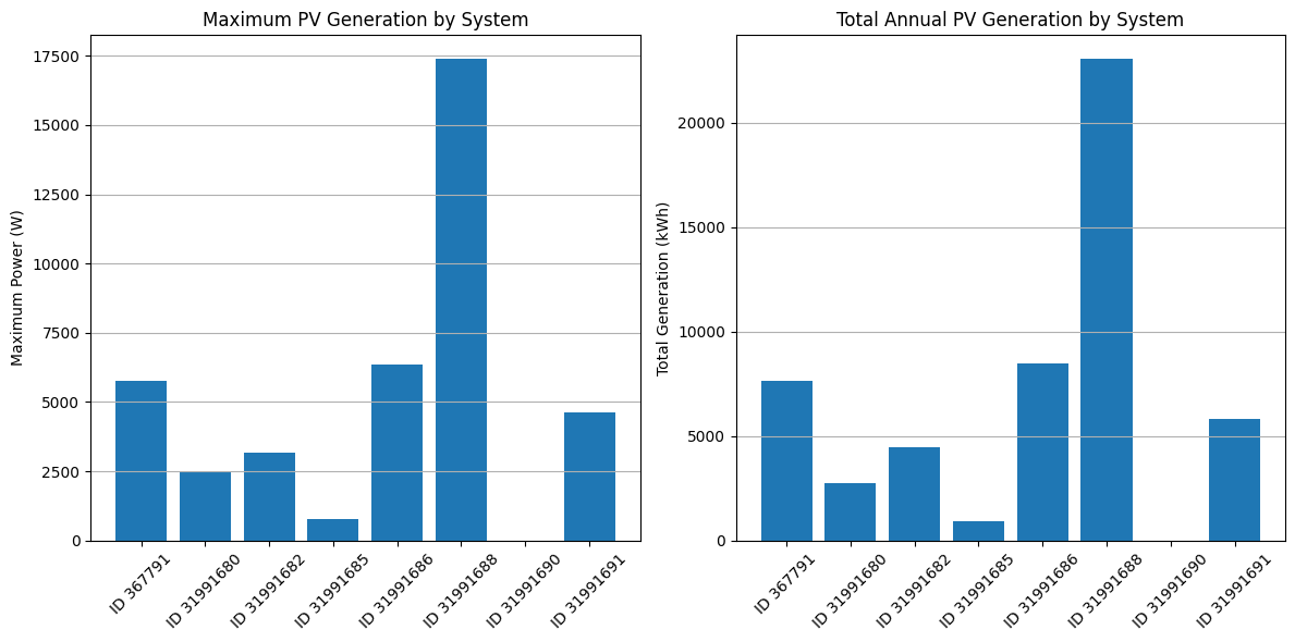
# Figure 1: Comparative analysis between different PV systems
# Get the maximum generation for each system
max_gen = {}
total_gen = {}
for obj_id in df:
    # Extract scalar value from Series
    max_value = df[obj_id][Types.PV].max()
    if hasattr(max_value, 'iloc'):
        max_value = max_value.iloc[0]
    max_gen[obj_id] = max_value

    # Extract scalar value from Series
    total_value = df[obj_id][Types.PV].sum() / 1000  # Convert to kWh
    if hasattr(total_value, 'iloc'):
        total_value = total_value.iloc[0]
    total_gen[obj_id] = total_value

# Create a bar chart for maximum generation
plt.figure(figsize=(12, 6))
plt.subplot(1, 2, 1)
plt.bar(range(len(max_gen)), list(max_gen.values()))
plt.xticks(range(len(max_gen)), [f'ID {id}' for id in max_gen.keys()], rotation=45)
plt.title('Maximum PV Generation by System')
plt.ylabel('Maximum Power (W)')
plt.grid(axis='y')

# Create a bar chart for total generation
plt.subplot(1, 2, 2)
plt.bar(range(len(total_gen)), list(total_gen.values()))
plt.xticks(range(len(total_gen)), [f'ID {id}' for id in total_gen.keys()], rotation=45)
plt.title('Total Annual PV Generation by System')
plt.ylabel('Total Generation (kWh)')
plt.grid(axis='y')

plt.tight_layout()
plt.show()
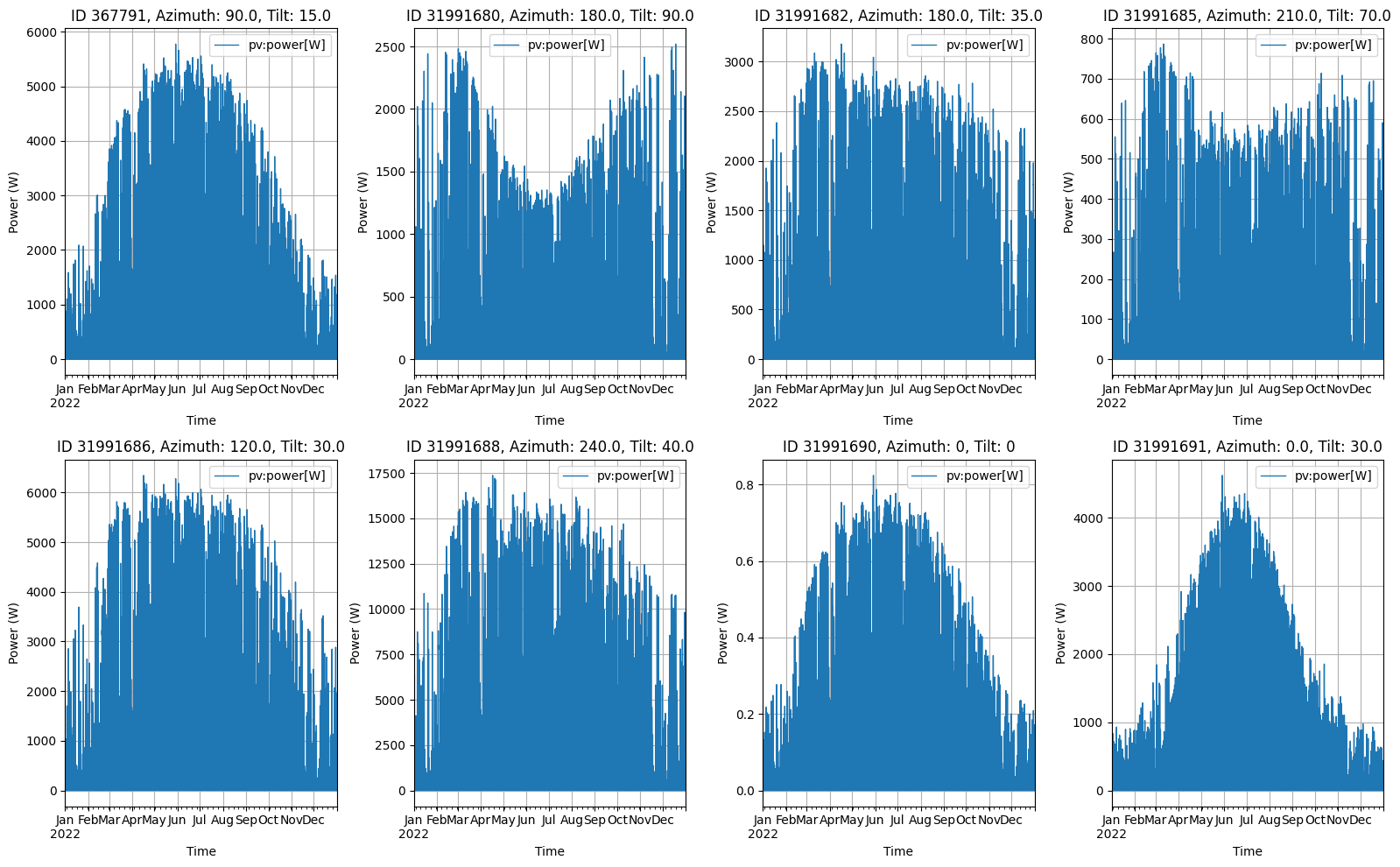
# Figure 2: Year timeseries visualization for all systems
fig, axes = plt.subplots(2, 4, figsize=(16, 10))
axes = axes.flatten()  # Flatten the 2D array of axes for easier indexing

# For each PV system, create a separate subplot
for i, obj_id in enumerate(df):
    # Get azimuth and tilt values for the title
    azimuth = system_configs[obj_id]['azimuth'] if obj_id in system_configs else 0
    tilt = system_configs[obj_id]['tilt'] if obj_id in system_configs else 0

    # Plot the time series
    df[obj_id][Types.PV].plot(ax=axes[i], color='#1f77b4', linewidth=1)
    axes[i].set_title(f'ID {obj_id}, Azimuth: {azimuth}, Tilt: {tilt}')
    axes[i].set_xlabel('Time')
    axes[i].set_ylabel('Power (W)')
    axes[i].grid(True)

plt.tight_layout()
plt.show()
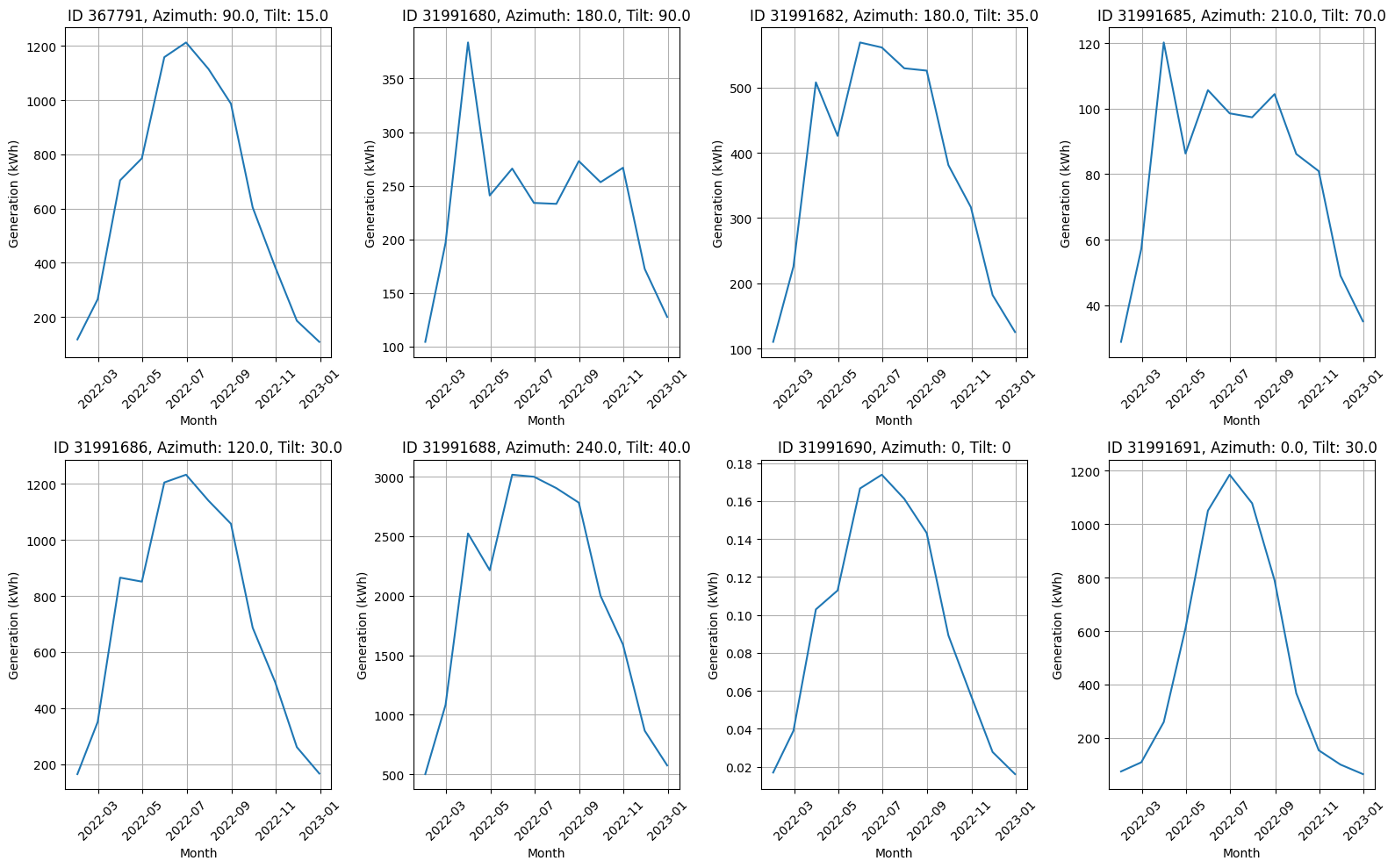
# Figure 3: Monthly generation analysis
# Create a figure with 8 subfigures (2x4 grid)
fig, axes = plt.subplots(2, 4, figsize=(16, 10))
axes = axes.flatten()  # Flatten the 2D array of axes for easier indexing
monthly_data = {}

# For each PV system, create a separate subplot
for i, obj_id in enumerate(df):
    ts = df[obj_id][Types.PV]
    # Resample to monthly sums
    monthly = ts.resample('M').sum()
    monthly_data[obj_id] = monthly

    # Get azimuth and tilt values for the title
    azimuth = system_configs[obj_id]['azimuth'] if obj_id in system_configs else 0
    tilt = system_configs[obj_id]['tilt'] if obj_id in system_configs else 0

    # Plot on the corresponding subplot
    axes[i].plot(monthly.index, monthly.values / 1000)
    axes[i].set_title(f'ID {obj_id}, Azimuth: {azimuth}, Tilt: {tilt}')
    axes[i].set_xlabel('Month')
    axes[i].set_ylabel('Generation (kWh)')
    axes[i].grid(True)
    axes[i].tick_params(axis='x', rotation=45)

plt.tight_layout()
plt.show()
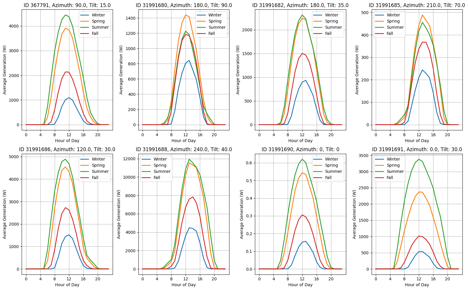
# Figure 4: Seasonal daily profile analysis
# Define seasons
seasons = {
    'Winter': [12, 1, 2],
    'Spring': [3, 4, 5],
    'Summer': [6, 7, 8],
    'Fall': [9, 10, 11]
}

# Create a figure with 8 subfigures (2x4 grid)
fig, axes = plt.subplots(2, 4, figsize=(16, 10))
axes = axes.flatten()  # Flatten the 2D array of axes for easier indexing

# For each PV system, create a separate subplot
for i, obj_id in enumerate(df):
    ts = df[obj_id][Types.PV]

    # Get azimuth and tilt values for the title
    azimuth = system_configs[obj_id]['azimuth'] if obj_id in system_configs else 0
    tilt = system_configs[obj_id]['tilt'] if obj_id in system_configs else 0

    # Plot each season on the same subplot
    for season_name, months in seasons.items():
        # Filter data for the season
        season_data = ts[ts.index.month.isin(months)]
        # Create average daily profile
        daily_profile = season_data.groupby(season_data.index.hour).mean()
        axes[i].plot(daily_profile.index, daily_profile.values, label=season_name, linewidth=2)

    axes[i].set_title(f'ID {obj_id}, Azimuth: {azimuth}, Tilt: {tilt}')
    axes[i].set_xlabel('Hour of Day')
    axes[i].set_ylabel('Average Generation (W)')
    axes[i].legend()
    axes[i].grid(True)
    axes[i].set_xticks(range(0, 24, 4))  # Show fewer ticks for readability

plt.tight_layout()
plt.show()
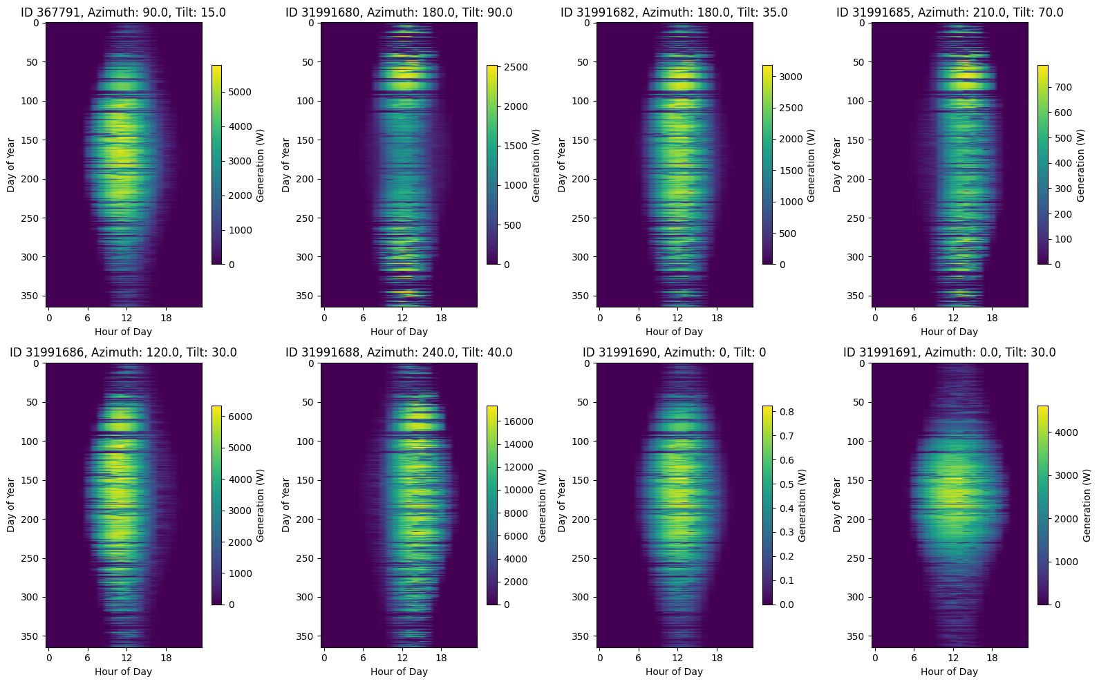
# Figure 5: Heatmap of daily generation patterns
# Create a figure with 8 subfigures (2x4 grid)
fig, axes = plt.subplots(2, 4, figsize=(16, 10))
axes = axes.flatten()  # Flatten the 2D array of axes for easier indexing

# For each PV system, create a separate subplot
for i, obj_id in enumerate(df):
    ts = df[obj_id][Types.PV]

    # Get azimuth and tilt values for the title
    azimuth = system_configs[obj_id]['azimuth'] if obj_id in system_configs else 0
    tilt = system_configs[obj_id]['tilt'] if obj_id in system_configs else 0

    # Create a pivot table with hours as columns and days as rows
    daily_data = ts.copy()
    daily_data.index = pd.MultiIndex.from_arrays([daily_data.index.date, daily_data.index.hour], names=['date', 'hour'])
    daily_pivot = daily_data.unstack(level='hour')

    # Create heatmap
    im = axes[i].imshow(daily_pivot, aspect='auto', cmap='viridis')
    axes[i].set_title(f'ID {obj_id}, Azimuth: {azimuth}, Tilt: {tilt}')
    axes[i].set_xlabel('Hour of Day')
    axes[i].set_ylabel('Day of Year')
    axes[i].set_xticks(range(0, 24, 6))  # Show fewer ticks for readability

    # Add colorbar to each subplot
    fig.colorbar(im, ax=axes[i], shrink=0.7, label='Generation (W)')

plt.tight_layout()
plt.show()
Next Steps
You can further explore:
Adjusting building parameters in
objects.csvIncorporating or excluding additional data (e.g., internal gains, solar gains)
Automating analysis for larger building datasets